Pages

Showing posts with label polish review. Show all posts

Saturday, February 4, 2012

Polish Review - Julep "Leah"

I just received my new Julep box, which means it's time for me to kick myself in the rear end and finish up last month's polishes!

Today for you, my darlings, I have Julep's "Leah", the last of the It-Girl January 2012 Maven polishes. This is the grass green, with a strong lacing of shimmer.


Grass green with a hint of shimmer describes this color well. It's surprisingly unique in my collection, and it is going to be a great color for summer. I'm not such a fan of it in winter, but hey, worse things have been worn out of season, right?
The color actually did last pretty nicely. Application was a little difficult; it did not want to dry, and it did not want to go on evenly after two coats, even though it definitely was a three-coater. In spite of this, I was glad that I got it, and it filled a hole in my colors. :)


Sunday, October 30, 2011

Polish Review - Chanel "Peridot"

I've been hinting at this for weeks and weeks, but.... I broke down and got a little box from Chanel. And what was inside this time? The object of all of my lust and desire itself: Peridot, from the Fall 2011 limited edition shades.

A little backstory on our romance? We first met in Zagreb at the same little salon I talked about a few months ago. However, Peridot was not yet on the market, so I got to try it out without being able to buy it, and went home with Black Pearl instead, haha. I then tried to order it a few months ago, only to find it was sold out. Then I made the mistake of checking back a couple of weeks ago, annnnnd...


Pardon the box's look of already having been raided. It was, hehe. And with Peridot and my little Eye Serum sample unboxed:


Peridot came along with two samples in all: a nice little to-go size of Vitalumiere Aqua in Beige Rose 30 (my color!) and Sublimage Eye Serum.


Peridot is a beautiful trichrome, flashing between a dark, almost jungle green, a burnt gold, and (especially in the bottle) a bright blue. It's hard as hell to pick up the jungle green on a camera, and nearly impossible to get that electric blue to come through on the nail.

Mmmm. Polish porn.


Application is really nice, and only the littlest bit brushstrokey. It also lasts a very long time once it's on the nail, with just a small amount of edgewear after some pretty rough treatment. It's a stunning polish, and it looks gold at first glance most of the time, but once you notice the multichrome, you can't stop looking at it!

I like Black Pearl a lot, but Peridot, my second Chanel polish, is just stunning. It was undoubtedly worth its price, and I think it will be sought after for a long, long time.


Monday, August 8, 2011

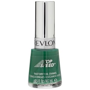
Polish Review - Revlon "Emerald"


Just a quick post while I try and catch up on some things I wanted to highlight...

Alas, the quest for the Dark Green Jelly Nail Polish has still not yielded any fruit (except for comments regarding impossible to find retired shades), so I have yet to try my dream gold shatter over emerald jelly. But while I wait for someone to invent that nail polish, I have a shade named Emerald for you.

Emerald is a dark grassy green that edges onto the blue side. It dries insanely fast and it could get away with one coat -- but that bothers me so I always throw on a second, lol. I also got bored about a day into wearing it and put on a coat of silver shatter. I got a lot of compliments on it, and it looked classy. I think if I was more careful and went for a really even shatter it could be a perfect Slytherin manicure.


Geek? Who, me? Slyth? Who, me?

It is a little on the dupe-y side. And now that I think about it, it definitely has something in common with some photos I have seen online of some (other) beautiful polishes that I covet very much: Daily Varnish in fact has a comparison of it against OPI "Jade is the New Black", which is ironically enough the polish I want right now more than any other.This kind of makes me a little sad in a way, because I always pictured Jade as even more on the blue side with some microshimmer (not that I had any reason to think there was shimmer -- this is just my crazy brain making up nonsense). Oh well. I still probably will spend the five bucks because I have wanted it for so long.


Application was just slightly on the watery side; very little chipping and even a small amount of edge-wear. If you want a really pretty medium green, go for it -- it'll only take a minute to set.


PS: Inspired by how much I liked the fast drying time on this one, I picked up Revlon Top Speed "Royal". Still lusting for "Espresso".

Thursday, August 4, 2011

Polish Review - OPI "Chop-Stickin' to My Story"

I have to admit -- the Hong Kong collection was what first really drew me to the OPI lines. I remember seeing the gorgeous counter display at my hair salon and going "I want that!" Unfortunately, I did not buy all of "that" when it was first available, but I have been going back through and acquiring some of the nicer polishes out of it. Cue...

Since I'm so light-skinned, I can usually get away with any shade of orange and bronze without clashing too horribly. I was after a bright summer color because I had been seeing swatches for all of the beautiful fall collections and was trying to get away from the greyed out and rich colors of fall. Unfortunately,  "Chop-Stickin' to My Story" tricked me.

"Chop-Stickin' to My Story" is a very nice color. It is a burnt-orange, though, not as bright as it looks in the bottle. It's going to be a beautiful fall shade -- I think it is very close to the shade that pumpkin pies should be when you don't burn them. The application is very smooth, and it is opaque in two coats; my first coat was a little iffy, but when is a first coat ever gorgeous?

This is a great pick for a darker orange. Polish lasted very nicely with just a little bit of edgewear. It probably could have gone a lot longer, but I started getting antsy to get a summer color, just like I had wanted in the beginning of this mani. Vampy Varnish did a really nice swatch of it, so head on over there to see. :)

Friday, July 22, 2011

Polish Review - OPI "Not Like the Movies"


Today I have another of the OPI Katy Perry polishes to share -- this one is the purple/silver/green polychromatic "Not Like the Movies".

This is a really pretty polish, and I tend to shy away from most purples and pinks on anti-girly principle, heh. I ended up with the poly/duochrome version of this, though I find the whole "silver NLTM" controversy really interesting. Why? Because I remember that when I first added it to my Amazon wishlist, where I keep track of all of the clothing and cosmetics that I eventually want, I thought of it as a silvery blue, not a purple duochrome. Don't get me wrong - I'm not sorry that I bought the polish, but it is also nice to know that I'm vindicated in my original perception! I did not know at all how "purple/green duochrome" could translate to "silvery blue" in my brain, though stranger things have happened. Now I would really like to find the silver bottle. Now, enough conceptual comments. On to the polish itself.

For some great pictures and a comparison with the dupe-like Deborah Lippman polish "Wicked Game", take a look Polishology's fantastic post.

The application is really nice, though with two coats it is really easy to get semi-visible bald patches that are not really visible until you get it at the wrong angle in the sunlight (though that's annoying as crap for me). Especially when it's going "purple", there is a really nice silver shimmer running throughout, but I have had problems with it "piling up". What I mean by this is that on a couple of nails, I have these goopy little bits where lots of shimmer decided to aggregate once it started to dry. It isn't horrible, but I think you can see it in the Polishology pictures as well. It also likes to collect at the edges of the nail, which you can see in those photos as well.

The color is really, really nice. The "purple" is the predominant color, and it's somewhere between a deep lavender and plum. The "green" is gorgeous and I wish it came out more -- a pretty olive with a lot of shimmer. 

This lasts a nice amount of time --  a little edge-wear, but not a lot of major chipping.
I honestly did not like this with Black Shatter. This is the second time I've tried NWTM, and I got through applying one nail with the shatter last time before I realized it would not work. It effectively kills the duo/polychrome aspect, and looks more like purple leopard print than NWTM+Black Shatter. Hey, wait, I have a shimmery purple/silver leopard print shirt... maybe I'll have to give the combination another chance this winter.

Do I like it? Yes, I wore it before I went to Europe and I almost brought it as one of my three polish choices for wearing over there, but I think the purple holds me back from wearing it a lot -- it's elegant, but I am just not a purple girl. Still, it's definitely staying, and the fact I'm giving it a second/third wear already should say that it is a great polish.

Thursday, July 21, 2011

Polish Review - OPI "Last Friday Night"

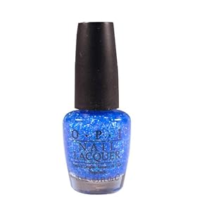
Today I have yet another nail polish review for you. I am wearing the sheer-as-hell blue-base, rainbow glitter explosion that is "Last Friday Night" by Katy Perry. The song is not one of my favorites off of the CD (and why don't we have an ET polish, I'd like to know, especially given the fabulous nail art that was about to come out of the video), but I do like the polish a lot.

It's sheer as hell. I am not exaggerating. The photo of the bottle might convince you that it has a fairly solidly blue base color, but it's barely even visible. But if you can tolerate that, and tolerate the fact that it will be between a four and seven-coater (also not exaggerating), it is a really, really pretty polish. It's eye-catching to me after two days wearing it, and even where it is a little bit goopy, you can't see it, because the eye doesn't like to see the lumpier areas. It's a really flattering shade of blue on light/blue-toned skin, too, once you can see it!

I also had the strangest phenomenon with this nail polish. Maybe it was because of the multi-multi-layers, but entire nails worth of polish would randomly start to disengage from the nail. They don't chip at all, but they completely come off! I do not understand why this is happening, but it's the only real drawback aside from the lack of opacity.

Will I wear it again, in spite of the problems? Definitely. It's shiny, and I like shiny things. :D

Tuesday, July 19, 2011

Polish Review - Catrice "Lost in Mud"


I picked up a bottle of this in the "Coin" chain while I was in Trieste, Italy, last month.

This is a really pretty neutral in that mushroom family that is so popular right now. It's a browned tan with grey undertones, and has a really nice rustic look. It also seems like it might be in the family of possible Particuliere dupes out there, though I don't have the original Chanel to confirm this.

Application was not bad, but it took a full three coats to be opaque; two coats left it fairly streaky. It didn't even have edge-wear for a couple of days, but I mangled it later; not really the fault of the polish. It's going to be a nice shade come fall, but for now, I think it's staying in the stash while brights reign.

A great picture (and comparison to Chanel) can be found on Lacquerized.

Not much more for now; I will post on starting some shopping later, once my new Invisalign-aligners stop driving me crazy...

Tuesday, May 31, 2011

Polish Review - OPI "Simply Smashing"

Sorry for the delay in finally putting this review up! Between some last-minute trip details and shopping (!) at a store that had some older OPI polishes for two bucks apiece, I have been keeping busy. And then there's work, of course...
 

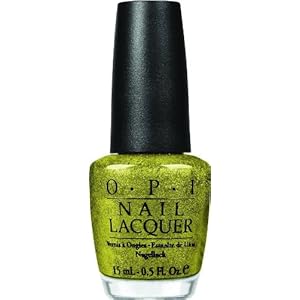
Anyway, down to business. I finally got around to using the beautiful new "Simply Smashing" glitter-ific polish in OPI's Grand Slam Serena set. I absolutely adore it; I have a thing for foils and metallics, and this looks like some sort of metallic trophy -- in tennis ball color. I did think it would be a little more green before I saw the bottle (and the nails) in person, but it's still a really, really pretty color. No apparent dupes.

Application is surprisingly smooth for how much glitter is packed in there, and it came off pretty easily with acetone. It did have the odd after-effect of turning my nails a slight shade of yellow, but I can't actually complain (especially since it did come off, unlike some glitters). It also probably could have gone another week and a half before I really would have had to take it off, but I was dying to try out my new Essie polish, "Da Bush".

This color is beautiful and stands alone nicely. When I first applied it I was about to run late for work, so I waited a good day before I finally put on a coat of Black Shatter on top. It changes the look of the polish quite a lot, taking it from being trendy on its own to... being trendy because it has a shatter on top. I think I would rather wear this one alone, though I got a lot of compliments -- most of which suggested that it had a reptilian or leopard look after I put on the shatter. I think it really depends what look you are going for, but be aware that it is absolutely lovely on its own. Re: tennis ball color, I would like to see it with the white shatter that OPI packaged with Spark de Triomphe -- sort of like how real tennis balls have the lines running across them.

Want pretty pictures? My nails refuse to grow, and my cuticles hate the humidity (or rather, the lack thereof). Go look at Death by Polish or Pampered and Polished for some gorgeous pictures. 

Next up will be Essie's "Da Bush", and hopefully EuroFashion, my style, via Polyvore! Then we should have one or two more manicures before zero hour for trip time. Candidates include OPI Fiercely Fiona, Zoya Dovima (Matte), or anything I can get my lacquered hands on before I leave. Hmm, I'm going to get my hair done tomorrow, and they sell OPI/Essie... I (or my bank account) may be a goner if they have the Pirates or more Serena collections.

Saturday, May 28, 2011

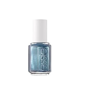
Polish Review - Essie "Fair Game"

Another week another couple of polishes, right? I have been painting nails more than I've been creative on Polyvore, and this past week slipped by ridiculously quickly, so you all get a couple of polish reviews to sate you until I start putting together my Europe looks!
The first polish I did for last week I am absolutely in love with. I picked up a couple of the Essie Resort 2011 collection polishes, "Fair Game" and "Da Bush", and since I had been playing in the gold/green family a lot lately, I went for "Fair Game" first. "Fair Game" is gorgeous. It is a steely blue metallic with a bit of a shimmer that goes from a more grey platinum in the shade to a richer blue in the sun. I had a million compliments, and it wears beautifully! I did not use a topcoat on it, but I had no major chips, and only a little bit of wear at the tip. It applied ridiculously smoothly, and dries really quickly. Two coats got it completely opaque.

I did finally broke down near the end of wearing this manicure and slap on a shatter coat on top. I think that there is not quite enough shimmer to make it stand out against the shatter; it looked murky and not particularly appealing; I wouldn't pair these two together.

Confession time: I had been trying to grow out my nails and make my cuticles look pretty enough for a photograph, but once again I started getting stressed, and now my almost-to-the-edge-of-the-finger nails are shorn back down like little shatter-covered sheep. Oh well, we'll try again so they look decent by the time I'm in Rome! Until then, head over to Musings from Manhattan or Scrangie for some gorgeous and very accurate photos!

Love until I get back from raiding the local salons for OPI Serena sets...

Next

Tuesday, May 24, 2011

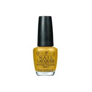
Polish Review - OPI "Bling Dynasty"

It will be a busy week for the blog and the blog owner -- I've gone through about four manicures in a week after I splurged on a couple of nail polish orders, I am packing for a month overseas, and may even have a few new Polyvore sets to share with you. Hang tight!

At the same time that I picked up "Drastic" because I was obsessed with trying out a dark jelly, I also ordered OPI's "Bling Dynasty" from the Spring 2010 Hong Kong collection. I love all things Hong Kong, and I remember seeing some beautiful displays at my salon when this set was released.


Once I got through admiring "Drastic", I switched over to "Bling Dynasty" to wear for a few days. It's a very rich gold -- more on the burnished "old gold" side than a cooler tone (it's toasty-warm enough that the office started calling it "Waffle" at breakfast), and it has a very concentrated microglitter that looks lovely. 

I admit that I absolutely adore golds and bronze polishes. This one is somewhere between a true gold and bronze, so it is definitely staying in my collection! It lasted really well with very little wear on the tips, then my second splurge-y order came in the mail. Two coats provided full coverage, but beware! I applied a top coat later and it dulled this beautiful color quite a lot -- it lasts wonderfully on its own, so don't spoil it.

The only thing that I have that is dupe-y for "Bling Dynasty" is an old L'Oreal ShockProof color called "Bronze Coin". Aside from being my favorite polish in existence, however, "Bronze Coin" is also a perle finish, though it has the same rich color and a similar glitter flash. It's not quite as flashy as "Bling Dynasty", but if you have "Bronze Coin", you might be able to go without getting Bling depending on how rich you want the color.

PerryPie has some accurate and beautiful pictures of this polish; I promise that one of these days I will actually have nails that are long enough to show off these colors.

Things to come: Essie's "Fair Game", and tales of a fashion whore trying to pack for a month in one backpack. Oof!

EDIT: August 05, 2011: I think I may finally have found a true dupe, though I am going completely off some images, not an in-person comparison. I want to buy this polish just to see! Take a look at these photos on the blog "A Sin Worth Committing". I don't know, but I think we may have a close relative!