Pages

Showing posts with label opi. Show all posts

Monday, August 20, 2012

OPI's James Bond Collection - A Creative Affair

Sooo...

I just saw over on College Fashion that there is a new OPI set coming out based on what may really be my favorite film franchise of all time (and at least my favorite set in the last ten-fifteen years): the Bond movies.

Being bored (actually, procrastinating), I decided not to look at the colors and to create what would be my own Bond collection, if I were designing for OPI. I did see the two for Man With the Golden Gun and Spy Who Loved Me, but I will try to be fair in spite of knowing what OPI did with them. As a warning, though, there are a few I have never seen out of the movies (scandalous, I am well aware...), so those are omitted below. So if any of these others happen to overlap, then my brainwaves and OPI's designers' must be aligned!

1. Doctor No - Honey's Shells
    A pale shell-pink creme with just a hint of white microshimmer, inspired by Honey Rider's iconic bikini.


2. From Russia With Love - Hidden Microfilm
    A rich black creme with a rubbery finish. Tough but glamorous, just like the KGB.


3. Goldfinger - Golden Galore
    An innevitable gold like its namesake, Goldfinger throws a wrinkle into its predictability by being a harvest gold matte, packed with copper-brown undertones. Perfect for a tough, mod girl who loves her metals.


4. Thunderball - Something to Put On
    In homage to one of the classic Bond femme fatales, this shimmer-filled light turquoise might just turn you into a bad girl too.


5. You Only Live Twice - SPECTRE of a Volcano
    This dark, firey red-orange creme is lava-hot, just like SPECTRE's volcanic fortress.


6. On Her Majesty's Secret Service - A Diamond for Tracy
    The ice of the Swiss alps and the single time Bond was ever married unite to produce this silver foil with holographic hex-glitter that catch the light, just like Tracy's ring.


7. Diamonds Are Forever - Tiffany's Hoard
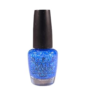
    We think diamond smuggler Tiffany Case would have appreciate this polish, also inspired by diamonds -- this one is a dark blue glitter, packed with medium to dark blue shimmer.


8. Live and Let Die - Live and Let Polish
    This murky, medium camo-green creme polish might call to mind the Louisiana swamp. We hope you have a Q-approved boat!


9. The Man With the Golden Gun - She Charges a Million a Nail
    This bright yellow-gold foil has nearly a mirror finish, but unlike a golden gun, it hopefully it won't be the last thing you see...


10. The Spy Who Loved Me - Stilettos Full of Sand
     Russian agent Anya Amasova may never want to see sand again after her tenure in Egypt, but that doesn't mean you can't appreciate this sand-colored creme.


11. Moonraker - Double-Zero-Gravity
    This rich, midnight blue is packed with a black microshimmer that might send you flocking to the moon, too.

 
12. For Your Eyes Only - Your Island Only
    When you can't make it to your own Greek island retreat, remember the beauty of it with this dark teal creme, reminiscent of the clear Mediterranean waters.


13. Octopussy - Uh-Oh Where'd You Find That Calamari?
     In addition to celebrating the brilliant colors of the Indian setting of Octopussy, we like to think this polish is in honor of the eponymous character's beloved pet, this pale orange polish is packed with screaming violet glitter. Just make sure the real critter doesn't end up breaded.


14. A View to a Kill - May Day! May Day!
    If this dark purple polish calls to mind Grace Jones, it's probably because the iconic Jamaican actress' costuming inspired this rich shade of violet.

 
17. Goldeneye - Onatopp Coat
    This gold and black glitter top coat will make even your worst enemies respect you.


18. Tomorrow Never Dies - M Stands for More Polish
    We think even Bond's proper British supervisor, M, couldn't resist this pelican grey polish, perfected with just a hint of a shimmer.


19. The World is Not Enough - Bloody Sexy
    You may just be a Bond Girl by sporting this vampy burgundy creme polish -- but even a Bond Girl gets what's coming to her when she's trying to corrupt a double-oh.


20. Die Another Day - Frosty Reception
    Miranda Frost might have "ice queen" down perfect, but even she would love this light lavender creme, laced with a double dose of silver shimmer.


21. Casino Royale - Half a Measure of Kina Lillet 
   Like the Vesper for which Bond's new martini is named, we think you'll love this classic dark red. Pair it with a dark, smoky eye and a matching lipstick, and nobody at the table will be looking at their cards.


22. Quantum of Solace - Just Fields
    This pale khaki creme would be in place in Siena or Bolivia. Just don't inhale any oil if you're caught wearing it.


I hope you guys like this! Now I'm off to see what OPI really is doing...

Comment below with what you would have designed! And what's your favorite Bond movie? Mine is by and far Casino Royale, but Thunderball is definitely the runner-up.

Saturday, September 3, 2011

Polish Review - OPI "Suzy Says Feng Shui"

Today I have one of my all-time favorite nail polishes to share with you. It's the medium blue-teal, gorgeous, stunning creme...


... Suzy Says Feng Shui, a stunningly beautiful polish with an incredibly rich depth and a beautiful, smooth application. I would wear this polish forever if I didn't get bored with everything after a day or two. :-P

It appears light blue in a lot of swatches, but it is definitely a deeper color -- it may be medium in tone, but the color looks a mile deep, and that is with only two coats! I adore this color. It has just enough of a hint of green to push it to a teal in some lighting (squee!), but not enough to be a full-out teal color.

This polish was part of the "Hong Kong" collection, which I am sure I raved about on one of my other "Hong Kong" reviews. It also is the one responsible for hooking me into nail polish and OPI.

This is a must-have polish. It looks fantastic, wears well, and packs a punch without being too bold; it's an elegant blue.

For swatches, Nikki's Nails has a nice view of the "blue" look for the polish, and All Lacquered Up catches a little of the teal.

Thursday, August 4, 2011

Polish Review - OPI "Chop-Stickin' to My Story"

I have to admit -- the Hong Kong collection was what first really drew me to the OPI lines. I remember seeing the gorgeous counter display at my hair salon and going "I want that!" Unfortunately, I did not buy all of "that" when it was first available, but I have been going back through and acquiring some of the nicer polishes out of it. Cue...

Since I'm so light-skinned, I can usually get away with any shade of orange and bronze without clashing too horribly. I was after a bright summer color because I had been seeing swatches for all of the beautiful fall collections and was trying to get away from the greyed out and rich colors of fall. Unfortunately,  "Chop-Stickin' to My Story" tricked me.

"Chop-Stickin' to My Story" is a very nice color. It is a burnt-orange, though, not as bright as it looks in the bottle. It's going to be a beautiful fall shade -- I think it is very close to the shade that pumpkin pies should be when you don't burn them. The application is very smooth, and it is opaque in two coats; my first coat was a little iffy, but when is a first coat ever gorgeous?

This is a great pick for a darker orange. Polish lasted very nicely with just a little bit of edgewear. It probably could have gone a lot longer, but I started getting antsy to get a summer color, just like I had wanted in the beginning of this mani. Vampy Varnish did a really nice swatch of it, so head on over there to see. :)

Friday, July 22, 2011

Polish Review - OPI "Not Like the Movies"


Today I have another of the OPI Katy Perry polishes to share -- this one is the purple/silver/green polychromatic "Not Like the Movies".

This is a really pretty polish, and I tend to shy away from most purples and pinks on anti-girly principle, heh. I ended up with the poly/duochrome version of this, though I find the whole "silver NLTM" controversy really interesting. Why? Because I remember that when I first added it to my Amazon wishlist, where I keep track of all of the clothing and cosmetics that I eventually want, I thought of it as a silvery blue, not a purple duochrome. Don't get me wrong - I'm not sorry that I bought the polish, but it is also nice to know that I'm vindicated in my original perception! I did not know at all how "purple/green duochrome" could translate to "silvery blue" in my brain, though stranger things have happened. Now I would really like to find the silver bottle. Now, enough conceptual comments. On to the polish itself.

For some great pictures and a comparison with the dupe-like Deborah Lippman polish "Wicked Game", take a look Polishology's fantastic post.

The application is really nice, though with two coats it is really easy to get semi-visible bald patches that are not really visible until you get it at the wrong angle in the sunlight (though that's annoying as crap for me). Especially when it's going "purple", there is a really nice silver shimmer running throughout, but I have had problems with it "piling up". What I mean by this is that on a couple of nails, I have these goopy little bits where lots of shimmer decided to aggregate once it started to dry. It isn't horrible, but I think you can see it in the Polishology pictures as well. It also likes to collect at the edges of the nail, which you can see in those photos as well.

The color is really, really nice. The "purple" is the predominant color, and it's somewhere between a deep lavender and plum. The "green" is gorgeous and I wish it came out more -- a pretty olive with a lot of shimmer. 

This lasts a nice amount of time --  a little edge-wear, but not a lot of major chipping.
I honestly did not like this with Black Shatter. This is the second time I've tried NWTM, and I got through applying one nail with the shatter last time before I realized it would not work. It effectively kills the duo/polychrome aspect, and looks more like purple leopard print than NWTM+Black Shatter. Hey, wait, I have a shimmery purple/silver leopard print shirt... maybe I'll have to give the combination another chance this winter.

Do I like it? Yes, I wore it before I went to Europe and I almost brought it as one of my three polish choices for wearing over there, but I think the purple holds me back from wearing it a lot -- it's elegant, but I am just not a purple girl. Still, it's definitely staying, and the fact I'm giving it a second/third wear already should say that it is a great polish.

Thursday, July 21, 2011

Polish Review - OPI "Last Friday Night"

Today I have yet another nail polish review for you. I am wearing the sheer-as-hell blue-base, rainbow glitter explosion that is "Last Friday Night" by Katy Perry. The song is not one of my favorites off of the CD (and why don't we have an ET polish, I'd like to know, especially given the fabulous nail art that was about to come out of the video), but I do like the polish a lot.

It's sheer as hell. I am not exaggerating. The photo of the bottle might convince you that it has a fairly solidly blue base color, but it's barely even visible. But if you can tolerate that, and tolerate the fact that it will be between a four and seven-coater (also not exaggerating), it is a really, really pretty polish. It's eye-catching to me after two days wearing it, and even where it is a little bit goopy, you can't see it, because the eye doesn't like to see the lumpier areas. It's a really flattering shade of blue on light/blue-toned skin, too, once you can see it!

I also had the strangest phenomenon with this nail polish. Maybe it was because of the multi-multi-layers, but entire nails worth of polish would randomly start to disengage from the nail. They don't chip at all, but they completely come off! I do not understand why this is happening, but it's the only real drawback aside from the lack of opacity.

Will I wear it again, in spite of the problems? Definitely. It's shiny, and I like shiny things. :D

Tuesday, May 31, 2011

Polish Review - OPI "Simply Smashing"

Sorry for the delay in finally putting this review up! Between some last-minute trip details and shopping (!) at a store that had some older OPI polishes for two bucks apiece, I have been keeping busy. And then there's work, of course...
 

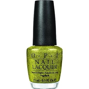
Anyway, down to business. I finally got around to using the beautiful new "Simply Smashing" glitter-ific polish in OPI's Grand Slam Serena set. I absolutely adore it; I have a thing for foils and metallics, and this looks like some sort of metallic trophy -- in tennis ball color. I did think it would be a little more green before I saw the bottle (and the nails) in person, but it's still a really, really pretty color. No apparent dupes.

Application is surprisingly smooth for how much glitter is packed in there, and it came off pretty easily with acetone. It did have the odd after-effect of turning my nails a slight shade of yellow, but I can't actually complain (especially since it did come off, unlike some glitters). It also probably could have gone another week and a half before I really would have had to take it off, but I was dying to try out my new Essie polish, "Da Bush".

This color is beautiful and stands alone nicely. When I first applied it I was about to run late for work, so I waited a good day before I finally put on a coat of Black Shatter on top. It changes the look of the polish quite a lot, taking it from being trendy on its own to... being trendy because it has a shatter on top. I think I would rather wear this one alone, though I got a lot of compliments -- most of which suggested that it had a reptilian or leopard look after I put on the shatter. I think it really depends what look you are going for, but be aware that it is absolutely lovely on its own. Re: tennis ball color, I would like to see it with the white shatter that OPI packaged with Spark de Triomphe -- sort of like how real tennis balls have the lines running across them.

Want pretty pictures? My nails refuse to grow, and my cuticles hate the humidity (or rather, the lack thereof). Go look at Death by Polish or Pampered and Polished for some gorgeous pictures. 

Next up will be Essie's "Da Bush", and hopefully EuroFashion, my style, via Polyvore! Then we should have one or two more manicures before zero hour for trip time. Candidates include OPI Fiercely Fiona, Zoya Dovima (Matte), or anything I can get my lacquered hands on before I leave. Hmm, I'm going to get my hair done tomorrow, and they sell OPI/Essie... I (or my bank account) may be a goner if they have the Pirates or more Serena collections.

Tuesday, May 24, 2011

Polish Review - OPI "Bling Dynasty"

It will be a busy week for the blog and the blog owner -- I've gone through about four manicures in a week after I splurged on a couple of nail polish orders, I am packing for a month overseas, and may even have a few new Polyvore sets to share with you. Hang tight!

At the same time that I picked up "Drastic" because I was obsessed with trying out a dark jelly, I also ordered OPI's "Bling Dynasty" from the Spring 2010 Hong Kong collection. I love all things Hong Kong, and I remember seeing some beautiful displays at my salon when this set was released.


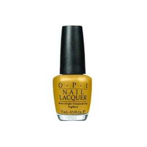
Once I got through admiring "Drastic", I switched over to "Bling Dynasty" to wear for a few days. It's a very rich gold -- more on the burnished "old gold" side than a cooler tone (it's toasty-warm enough that the office started calling it "Waffle" at breakfast), and it has a very concentrated microglitter that looks lovely. 

I admit that I absolutely adore golds and bronze polishes. This one is somewhere between a true gold and bronze, so it is definitely staying in my collection! It lasted really well with very little wear on the tips, then my second splurge-y order came in the mail. Two coats provided full coverage, but beware! I applied a top coat later and it dulled this beautiful color quite a lot -- it lasts wonderfully on its own, so don't spoil it.

The only thing that I have that is dupe-y for "Bling Dynasty" is an old L'Oreal ShockProof color called "Bronze Coin". Aside from being my favorite polish in existence, however, "Bronze Coin" is also a perle finish, though it has the same rich color and a similar glitter flash. It's not quite as flashy as "Bling Dynasty", but if you have "Bronze Coin", you might be able to go without getting Bling depending on how rich you want the color.

PerryPie has some accurate and beautiful pictures of this polish; I promise that one of these days I will actually have nails that are long enough to show off these colors.

Things to come: Essie's "Fair Game", and tales of a fashion whore trying to pack for a month in one backpack. Oof!

EDIT: August 05, 2011: I think I may finally have found a true dupe, though I am going completely off some images, not an in-person comparison. I want to buy this polish just to see! Take a look at these photos on the blog "A Sin Worth Committing". I don't know, but I think we may have a close relative!